Have you ever wondered how a complicated multi-step checkout process can negatively impact your sales and user experience? A smooth and fast checkout experience is essential—it helps convert visitors into customers by reducing friction during the purchasing process.
That’s where Knowband’s Prestashop One Page Supercheckout module comes in. It simplifies the entire checkout process by consolidating all the necessary steps onto a single page. This not only improves the user experience but also increases conversions by offering a faster and more intuitive checkout.
However, while customising your Supercheckout page, there are a few common mistakes that store owners often make. These errors can lead to poor performance, customer frustration, and lost sales.”
In this blog, we’ll go over some common mistakes people often make when customising the checkout page, and how you can avoid them to keep things running smoothly for your customers.
Mistakes that can happen when customising the checkout page
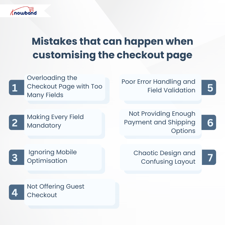
1. Overloading the Checkout Page with Too Many Fields
One of the most common mistakes is adding too many input fields. When customers reach the checkout page and are bombarded with dozens of fields to fill out, it can feel overwhelming. Instead of completing their purchase, many users simply abandon the cart.
Tip: Focus on only the most essential information, such as:
- First name
- Last name
- Email address
- Phone number
- Shipping and billing address
You can always collect additional information later, after the purchase is complete. Use
2. Making Every Field Mandatory
Not every field needs to be required. Making all fields mandatory, even the optional ones like “Company Name” or “Address Line 2” can frustrate users.
Forcing users to fill in unnecessary details increases friction. The goal should be to minimise the time and effort needed to complete a purchase.
Tip: You can only make some fields as required and keep the rest fields as not required. This small change can improve the checkout flow and reduce cart abandonment.
3. Ignoring Mobile Optimisation
Today, a large portion of online shopping happens on mobile devices. Yet many checkout customisations are designed with desktop users in mind, leading to poor mobile performance.
If your checkout page doesn’t work well on smartphones or is hard to use on smaller screens, you could end up losing a lot of customers.”
Tip: Make sure to test your Supercheckout layout on different devices and screen sizes to ensure everything looks and works as it should.
4. Not Offering Guest Checkout
Requiring users to create an account before checking out is a major barrier to conversion. Some customers simply want to buy quickly without signing up.
By not providing a guest checkout option, you’re essentially turning away users who don’t want to go through the registration process.
Tip: Offer a seamless guest checkout option and give users the choice to create an account after the purchase, if they wish.
5. Poor Error Handling and Field Validation
Another common mistake is vague or confusing error messages during form validation. If users receive generic messages like “Something went wrong,” they won’t know how to fix the issue.
This leads to frustration and potentially lost sales.
Tip: Use clear, specific validation messages. For example:
- “Please enter a valid phone number”
- “Email address cannot be left blank”
Also, highlight errors in real-time instead of after the user tries to submit the form.
6. Not Providing Enough Payment and Shipping Options
Customers appreciate having choices, especially when it comes to payment and shipping. If your checkout page only offers one or two limited options, users may abandon their cart in search of a store that better suits their needs.
Tip: Integrate multiple payment gateways (like PayPal, credit cards,and Apple Pay) and offer various shipping options, including express delivery and standard shipping.
This flexibility helps build trust and caters to a wider range of customer preferences.
7. Chaotic Design and Confusing Layout
A messy or overly complex layout can distract users and make it harder to complete their purchase. If the design lacks a clear visual hierarchy or has too many elements crammed into a small space, users might leave.
Tip: Stick to a clean and minimal design. Use clear headings, adequate spacing, and visible buttons. Ensure that the “Place Order” or “Proceed to Payment” button is prominently placed.
Conclusion
In conclusion, whether you’re running a small online shop or a large e-commerce brand, optimising your checkout page is key to maximising conversions. Avoiding the common mistakes mentioned above, such as overloading fields, poor mobile experience, lack of guest checkout, unclear error messages, limited payment options, and a cluttered design, can significantly improve the user journey. With Knowband’s Prestashop One Page Supercheckout Module, you already have the plugins you need to deliver a fast, seamless checkout experience. Use them wisely, and you’ll likely see a noticeable improvement in customer satisfaction and sales performance.
Also, you can check out the user guide for seamless integration of Prestashop’s One Page Checkout Module. You can also check out the Prestashop AI Content Generator & Translator Module here


