
Checkout abandonment is usually discussed as a statistical problem. The global rate is around 70%. PrestaShop stores are not exempt. What gets discussed less often is what’s actually happening in the customer’s head in the seconds before they close the tab, because that micro-level understanding determines whether any checkout improvement actually works. The difference between a customer who completes a purchase and one who abandons isn’t usually price or product confidence. By the time someone reaches checkout, those decisions are provisionally made. What unravels them is something much more immediate: friction, uncertainty, and the quiet erosion of momentum that multi-step checkout creates in ways most merchants never directly observe. A single-page checkout module for PrestaShop, such as Knowband’s PrestaShop One Page Checkout, addresses these triggers structurally, but understanding the triggers themselves is what makes the fix make sense.
The Momentum Problem: What a Page Reload Actually Costs at Checkout
PrestaShop’s default checkout routes customers through sequential pages. Each page transition, from billing address to shipping method to payment selection, requires a full page reload. From a technical standpoint, that’s a standard HTTP request. From the customer’s standpoint, it’s a pause that breaks the psychological state that got them there.
Purchase intent is not a static condition. The readiness to buy that a customer feels while browsing erodes during inactive moments, waiting for a page to load, scanning for where to click next, and processing a new screen layout. Each page reload in a multi-step checkout is a micro-interruption that gives the customer’s hesitation a moment to surface. The customer wasn’t looking for a reason to stop. The checkout provided one anyway.
This is compounded on mobile, where page reload latency is longer and unpredictable. Mobile checkout abandonment rates exceed 85%, a figure that reflects how much worse every structural friction point becomes on a slow connection and a small screen.
The Account Barrier: Why Mandatory Registration Feels Like a Wall at the Worst Moment
The single most researched cause of checkout abandonment is being forced to create an account before purchasing. Studies consistently place this in the top two reasons customers leave, ahead of unexpected shipping costs, technical errors, and concerns about payment security.
The reason isn’t that customers object to accounts in principle. The reason is timing. A customer who has spent twenty minutes choosing a product and is now ready to pay experiences account creation as an obstacle inserted between their decision and its completion. The mental state required to choose a password, verify an email, and fill out a registration form is incompatible with the momentum of a purchase decision. Decision fatigue sets in, and the exit becomes easier than the form.
Guest checkout removes this barrier entirely. The Knowband module makes guest checkout configurable as the default display state, while still offering optional automatic account registration in the background. The customer checks out as a guest, and the store creates the account and emails the password without requiring any additional action. Social login via Google and Facebook provides a third path for customers who want an account but won’t fill out a registration form.
The Uncertainty Loop: What Happens When Shoppers Don’t Know How Many Steps Remain
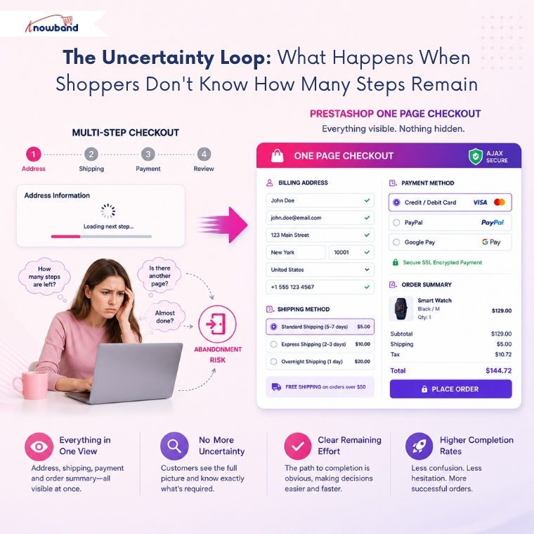
Ask any checkout UX researcher about the abandonment pattern that’s hardest to diagnose, and they’ll point to what happens when customers don’t know how many steps are left. PrestaShop’s default checkout has no inherent progress indicator visible between steps. A customer who has completed the address page doesn’t know if they have one more screen or four.
That uncertainty creates a specific behavioral loop: the customer starts to fill a field, pauses to assess whether continuing is worth the remaining unknown effort, and sometimes stops before the next screen ever loads. The checkout progress question, “how much more of this is there?”, is answered most effectively not with a progress bar but with the complete elimination of the multi-step structure.
A PrestaShop One Page Checkout renders every section, address, shipping, payment, and cart summary, visible simultaneously in a single AJAX popup. The customer sees the entire checkout in one view. The remaining effort is immediately apparent. The decision to proceed becomes simpler because there’s no unknown quantity left to estimate.
The Micro-Decision Problem at Shipping and Payment
The moment a customer sees shipping and payment options is also the moment most merchants underestimate. The choice isn’t just logistical; it carries real cognitive weight. A customer who selects a specific shipping method and then sees a payment option that conflicts with it, or finds that their preferred payment method has been disabled for that shipping tier, experiences confusion at the worst possible moment.
The Ship2Pay feature maps payment methods to specific shipping choices at the admin level. When a customer selects a shipping method, the corresponding payment options update automatically, no conflicting options appear, and no manual navigation is required. The customer’s next decision is clear rather than ambiguous.
This matters because ambiguity at the payment stage often produces what looks like technical abandonment in analytics, a customer who reached the payment screen and left, but is actually decision paralysis caused by an inconsistent options display. Removing the ambiguity removes the hesitation.
Inline Validation and the Post-Submit Failure That Kills Momentum
One of the most psychologically damaging checkout experiences is the post-submit validation failure. The customer fills out every field, clicks confirm, and then the page reloads with error messages scattered across the form. The effort invested in filling the form is now visually represented as failure. The customer has to find the errors, correct them, and try again, in a mental state that has now shifted from anticipated completion to frustration recovery.
Inline validation solves this by flagging errors the moment a customer leaves a field, while they’re still in the process of completing the form. The error appears before submission, while the customer’s attention is still on the relevant field. The correction is immediate rather than retroactive. The flow continues rather than restarting.
For a PrestaShop fast checkout addon that surfaces all fields simultaneously, inline validation is particularly important. The single-view layout means any field error that appears post-submission affects the entire visible form rather than an isolated screen.
The Behavioral Case for PrestaShop One Page Checkout
The abandonment problem at PrestaShop checkout isn’t primarily about price, product confidence, or even page speed in the conventional sense. It’s about the specific moments, page reloads, account prompts, unknown remaining steps, conflicting options, post-submit errors, where the customer’s purchase intent encounters friction it didn’t expect and doesn’t want to overcome.
PrestaShop One Page Checkout removes most of these friction points at a structural level rather than patching them individually. One screen eliminates the unknown-steps problem. The AJAX popup eliminates page reloads. Guest checkout eliminates the registration wall. Ship2Pay eliminates payment confusion. Inline validation eliminates post-submit failure states.
For merchants who’ve seen their checkout abandonment data and want to address its behavioral causes rather than its surface symptoms, a PrestaShop One Step Checkout Addon changes the structural conditions of the purchase moment, which is where the abandonment actually happens.


